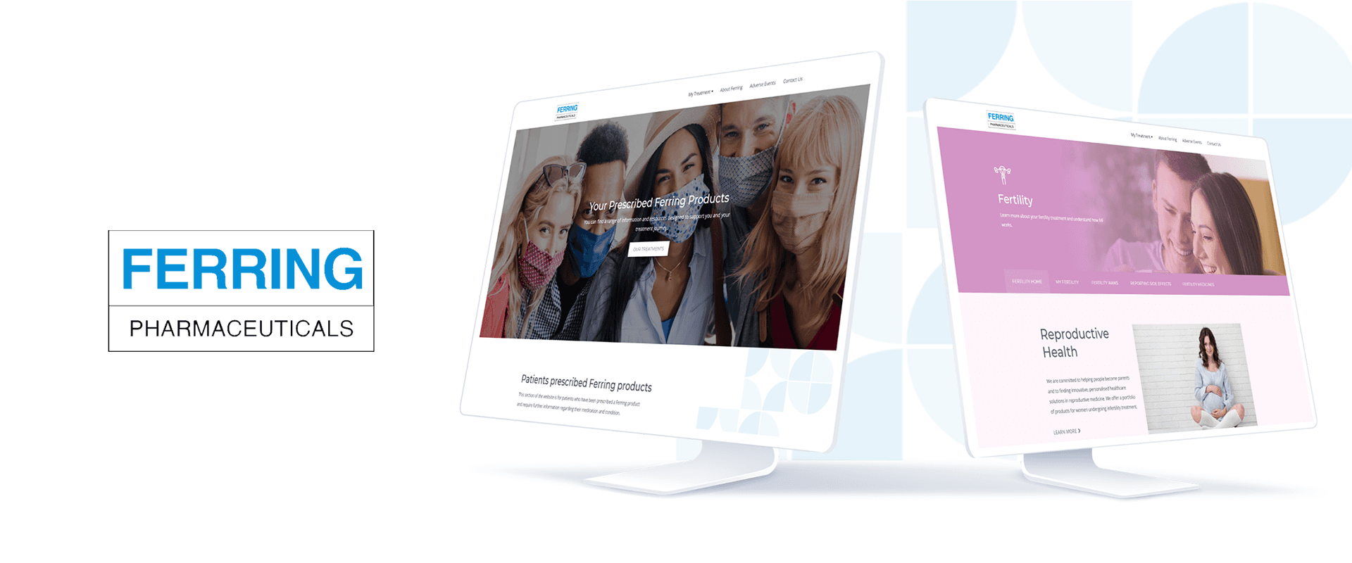
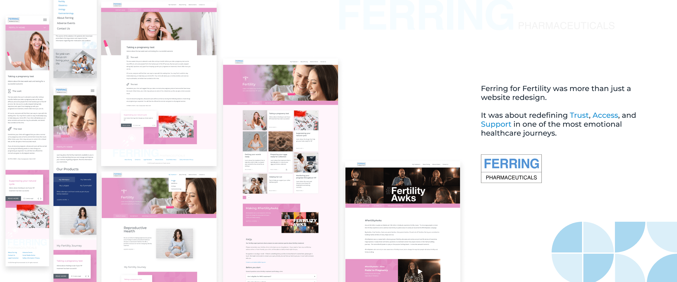
Ferring for Fertility
How we redefined the digital experience for Ferring for Fertility: Designing for Empathy and Efficiency in Healthcare
Industry
Healthcare
Role
Reasearch, Wireframing, Hi-Fi Design
Techstack
Axure Rp, Adobe Xd, Photoshop
Dated
Aug 2021
01
Overview
Ferring for Fertility is a UK-based digital platform by Ferring Pharmaceuticals, aimed at empowering healthcare professionals (HCPs) and patients with accurate, timely, and educational information in the domain of reproductive and maternal health
02
Problem Statement
Overwhelming Content Layout: Information was scattered and lacked a consistent visual structure.
No Clear Audience Segmentation: HCPs and patients had different needs, but navigated the same funnel.
Non-Responsive Design: The website didn’t adapt well to mobile devices — critical for HCPs on the go.
Low Engagement: Bounce rates were high, with low average session duration.
Outdated Aesthetics: The look and feel didn’t reflect Ferring’s credibility or modern innovation.
03
Our Goal
To create a modern, responsive, and intuitive digital platform that:
Clearly separates and prioritizes HCP and patient journeys
Improves access to information with structured content and IA
Aligns with Ferring’s brand and clinical trustworthiness
Enhances engagement and conversion metrics
Supports accessibility best practices
04
My Role
As the UI/UX Designer, I led the complete redesign from research to delivery. My responsibilities included:
Stakeholder interviews and audience research
Competitor and heuristic analysis
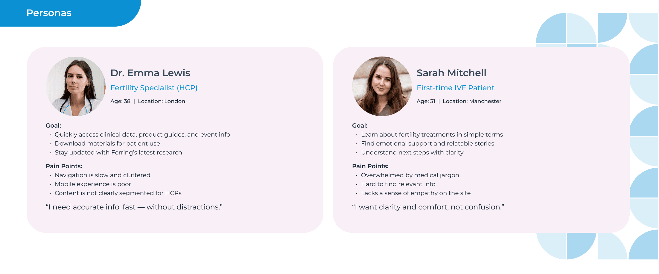
Defining personas and journey maps
Reimagining the Information Architecture
Creating wireframes, prototypes, and visual designs in Figma
Collaborating with developers for seamless hand-off
Conducting usability testing and iterative improvements
05
Research and Discovery
We began by speaking to real users — Healthcare Professionals, fertility clinic nurses, and patients.
Key Insights:
HCPs needed quick, reliable access to product data and clinical guidelines — ideally within 2 clicks.
Patients were emotionally vulnerable and sought clarity, empathy, and support in their journey.
Everyone found the existing site confusing and content-heavy with poor navigation.
06
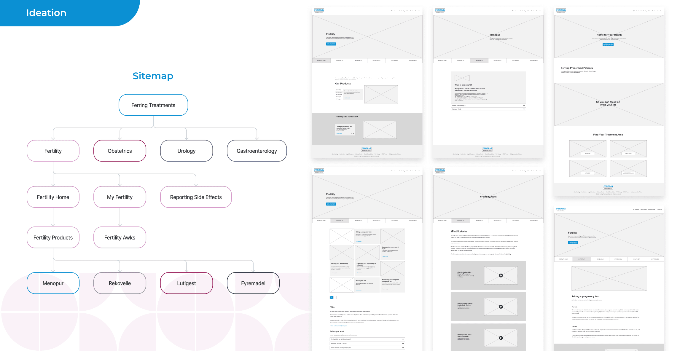
Design Strategy
Information Architecture Overhaul
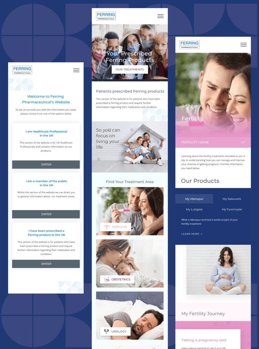
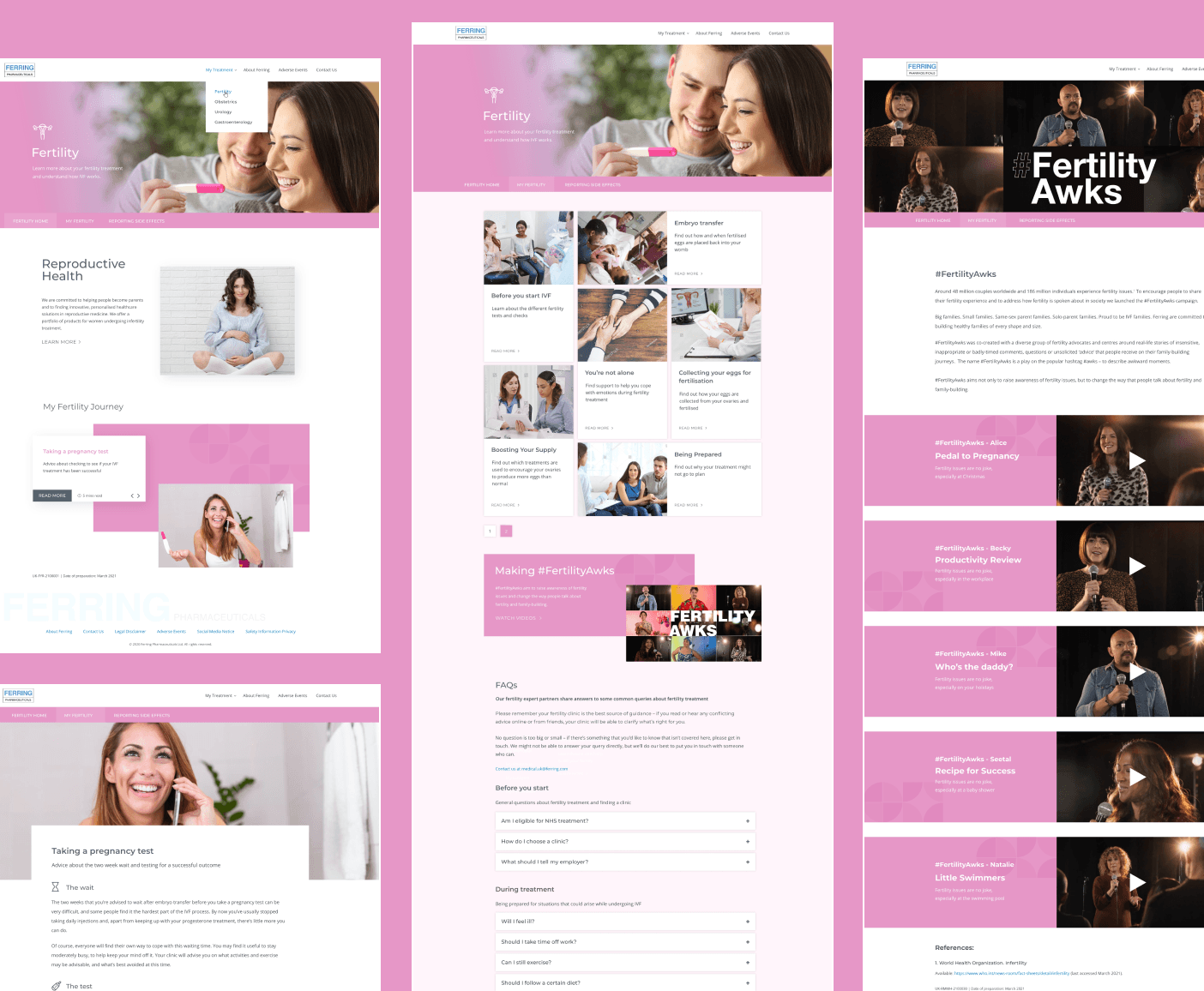
We completely restructured the content — separating user flows for HCPs and consumers, and simplifying the navigation. From a flat, text-heavy structure to a role-based, modular design.
Homepage Reimagined
Instead of trying to serve everyone at once, the homepage now guides users to their respective experiences with a clear CTA split.
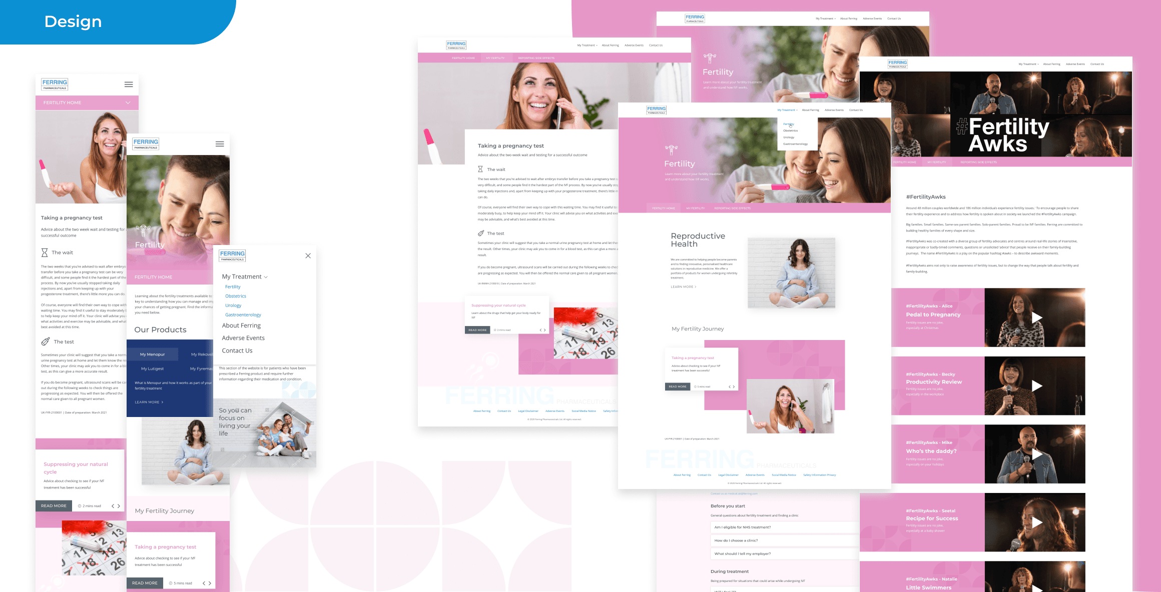
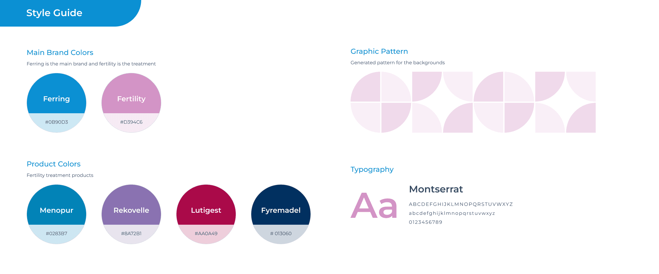
Clean, Clinical, and Empathetic Visual Design
We opted for a design that’s warm but authoritative. Subtle blues and whites create trust, while clean typography ensures readability. The new design aligns with healthcare best practices while staying emotionally resonant.
Mobile-First and Accessible
Fully responsive design with WCAG accessibility standards in place — ensuring inclusivity for all users.
07
Design Execution
Tools Used: Adobe XD (design + prototype), Axure Rp (early drafts), Photoshop (image manipulation)
System Design: Leveraged atomic design methodology for scalable UI components.
Typography: Large line-height and font contrast for better scanability.
Imagery: Real people, not stock models — humanizing the experience.
08
Impact
Key Outcomes After Launch:
40% decrease in bounce rate
25% increase in time spent on site
50% faster access to product PDFs for HCPs
95% mobile compatibility score (up from 60%)
Positive feedback from Ferring UK stakeholders on usability and tone of voice
09
Reflections
This wasn’t just a UI facelift. It was a shift in digital empathy understanding two deeply different personas and building tailored paths for each.
Designing for healthcare means making complex things feel simple and emotional journeys feel supported.